I think I’m going to channel Kaiser Fung of the Junk Charts blog today.
The page above is page 29 of the Oct 10-17 issue of Newsweek. Research is by Lauren Streib, infographic by Holly Gressley, edited evidently by nobody.
So what’s wrong with this?
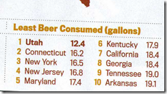
The upper left is the per capita consumption of beer. Finding Utah at the bottom is hardly a surprise:
But less than two inches away, under the heading “The United States of Beer” we see this:
Wait. We have 12.4 gallons of beer per person, but only 1 gallon of liquor? Maybe they mean hard liquor, but the heading is “The United States of Beer” so either the heading is misleading or the statistic is. And personally, I find it hard to believe there would be so little drinking in West Virginia – and in the map in the upper left, WV is not listed as being in the bottom 10, let along second last.
And again:
In the upper right we have the “20 Drunkest Countries”.
First of all, “drunkest” does not equate to “alcohol consumption”. Those are related concepts, but separable.
Second, this seems to be just beer. There are other things to get drunk on – vodka, gin, whiskey, cider, brandy, and wine might be other examples. In order to use alcohol consumption as a proxy for the amount of drunkenness, one would have to include all major sources of alcohol.
And there’s always the minor nit:
In the upper right, US consumption is listed as 20.9 gallons per person in 2010. In the lower left, US consumption is listed as 20.7 gallons per person in 2010.


No comments:
Post a Comment