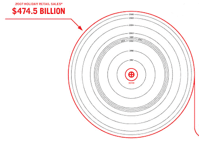
The graphics are pretty, but from a statistical standpoint pretty awful. Since the same graphics are available online, you can see them in all their glory and context here: http://awesome.goodmagazine.com/goodsheet/goodsheet011HolidayEconomy.html
First of all, we have this holiday economy chart with the red concentric circles.

Note in the center red circle we have $375B and on the outside circle we have $474.5B. No way that fits any possible metric for using charts like this. That's roughly a 20-25% increase, but the area of the $474.5B circle is vastly larger.
Second, we have the bar chart at the bottom. Luckily the actual figures are below the bars. You can see that 2002 was slightly less than 2001 in these figures – but that’s not shown in the actual bars, which seem to go up in an uninterrupted stream from left to right.

On that same bar chart, we can see the undercutting of the basic argument. The point of the entire 16 page handout is that spending on the holiday is an important thing to do because it's such an important season for retail sales. But is retail spending really as disproportionate as we have been led to believe? In 1998, retail sales were about $2 trillion. But Holiday sales (November and December) were $405 billion. So, in two months of the year (17%) we have 20% of the retail spending. That’s higher than average, but not drastically so.
What changes is that during the winter holidays a lot of the retail sales are spent on crap we don’t need / can defer / are better off without. If we look at the categories good.is breaks out, we see lots of stuff we don’t need: $700m in candle sales, 30-35 million Christmas trees, $9.3B in jewelry sales stick out as prime examples. Without Christmas, November and December would be expected to be a slow time for retail sales, as January and February are.
See also Kaiser's take on this chart at the JunkCharts blog http://junkcharts.typepad.com/junk_charts/2008/12/seen-at-starbucks.html
ReplyDeleteThe whole premise of that infographic was lost on me. The "tree-ring chart" looked like nothing more than a roll of toilet paper being unrolled, and the red outer ring had me thinking of red ink, as in huge losses, which is the general theme in the latter part of 2008. The unintended graphical metaphor of a roll of TP was saying our profits are in the toilet.
ReplyDeleteIt took closer examination to realize the chart was showing revenues, and I didn't see the cash register printer in the lower left corner until it was much too late to imprint the intended metaphor in my mind.
A few line charts would have told the story in a more understandable form: total revenues, holiday season revenues, and ratio of holiday sales to total sales. I've found, however, that the intent of most infographics like this is not to present useful numerical data, but to spread images and impressions, or to show off how clever the artist is (e.g., all the ascii art).
Regarding the scale of the tree rings, there obviously is a scale, but it doesn't start at zero, and the reader has no idea if the variable is encoded in the radius or the area of the circle.